How Color Affects Mood, Light, and the Overall Feel of Your Kitchen
The impact of color choices in kitchen painting is easy to see in daily life. The color on your walls and cabinets can make the room feel bigger, warmer, brighter, or calmer. Light shades often help small kitchens feel open. Dark shades can add depth, but they may also make the space feel smaller. In many homes around Mechanicsville, MD, the best color choice depends on natural light, cabinet style, and how the kitchen is used each day.
Quick Decision Answer
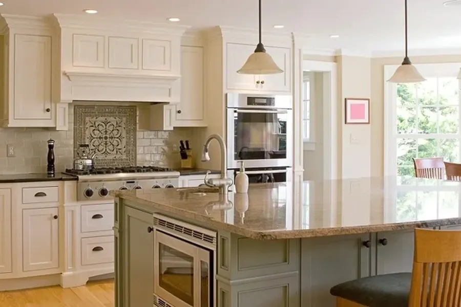
If you want a safe and flexible choice, soft white, warm beige, light gray, and muted green work well in most kitchen painting projects. If you want more personality, navy, charcoal, or deep green can look great when the room has enough light. The main choice is not just light versus dark. It is about how the color works with your counters, floors, cabinets, and daily routine.
Light Colors Vs Dark Colors
Many homeowners compare light colors with dark colors when planning kitchen painting. Light colors reflect more light. This helps the room feel clean and open. They are often a good fit for smaller kitchens or spaces with one small window. Dark colors absorb more light. They can create a rich, cozy style, but they need balance from brighter surfaces or better lighting.
Here are a few simple ways to compare them:
- Light colors make small kitchens feel larger
- Light colors often show less dust in low light
- Dark colors can add contrast and drama
- Dark colors may show smudges more clearly on some finishes
- Soft warm tones can make a kitchen feel more friendly
- Cool tones can make a kitchen feel crisp and modern
This is why color should match both style and function. A busy family kitchen may need a forgiving shade. A show kitchen may lean more bold. The service category keyword can also shape the plan when paint is only one part of a larger update.
Pros and Cons of Popular Kitchen Color Directions
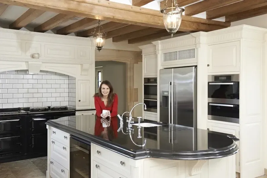
Each color group has strengths and weak points. White and off-white shades are popular because they work with many design styles. They also help older kitchens feel fresh. The downside is that some whites can look too stark under cool bulbs or next to warm wood cabinets.
Gray is still common, but the wrong gray can make a kitchen feel flat. A gray with warm undertones usually feels softer. Beige and greige are easier for many homes because they warm up the room without feeling too yellow.
Green is another strong option in kitchen painting. Soft sage can feel calm and natural. Deep green can feel bold and grounded. Blue can work well too, especially on cabinets or an accent wall, but very cool blues may feel cold in kitchens with limited sunlight.
Bold colors can be fun, but they are harder to change later. Neutral shades are easier to live with over time. That does not mean bold is wrong. It just means bold works best when the rest of the room supports it.
Best Fit by Kitchen Type and Daily Use
The best color choice often depends on how the kitchen is used. A small condo kitchen may need pale tones to stretch the space. A large open kitchen may handle deeper shades without feeling closed in. Homes with children or heavy cooking may do better with colors that hide marks and splashes.
Think about these common situations:
- Choose light neutrals for small kitchens with low natural light
- Choose warm whites for kitchens with wood floors or warm counters
- Choose muted greens for a soft, relaxed feel
- Choose darker accent colors for islands or lower cabinets
- Choose balanced mid-tone colors if you want less glare and less contrast
You should also think about your lighting. Morning light, evening light, and bulb color all change how paint looks. A color that seems perfect on a sample card can look very different on a full wall.
Mistakes People Make When Picking Colors
One common mistake is choosing a color without testing it in the real room. Paint often shifts during the day. Another mistake is copying a photo from the internet without checking the kitchen’s actual light, surfaces, and size. What works in one home may not work in another.
Some people also focus only on wall color and forget the whole room. In kitchen painting, the cabinets, backsplash, hardware, and flooring all matter. If the undertones fight each other, the room can feel off even when each piece looks fine by itself.
Another issue is going too trendy. A trendy shade may feel exciting now, but tiring later. If you want a trend-forward look, a safer move is using bold color in a smaller area, like an island, pantry door, or one feature wall.
Final Decision Checklist
Before choosing paint, use this simple checklist:
- Check how much natural light the kitchen gets
- Look at the undertones in counters, floors, and cabinets
- Test samples on more than one wall
- View the color in morning, afternoon, and evening light
- Pick a shade that fits how the room is used every day
- Decide if you want the kitchen to feel bright, cozy, calm, or bold
When you slow down and compare your options, kitchen painting becomes much easier. The right color can make an older kitchen feel cleaner, a dark kitchen feel brighter, or a plain kitchen feel more personal. Good color choices do more than change appearance. They affect comfort, mood, and how the whole space works.
Ready for Help With Your Next Project
If you are planning updates in Mechanicsville, MD, we can help you sort through colors that fit your light, layout, and goals. At DJ's Painting & Powerwashing, we take time to help homeowners choose shades that feel right day after day. Call us at (301) 861-9167 to talk with our team and schedule help for your kitchen painting project.